Responsive Web Design (RWD)
Responsive Web Design is an approach where a website is designed to automatically respond or resize itself contextually, depending on the type of device viewing it. Whether accessed through a large desktop monitor, a laptop, a tablet, or a smartphone, the content adjusts seamlessly to perfectly fit the available screen size.
Responsive Web Design is commonly known as RWD. Simply put: “the content flows like water,” gracefully filling whatever container (screen size) it is poured into.
RWD has been the industry standard for entirely practical reasons—principally the explosive growth of smartphones and mobile devices. A massive variety of screen sizes have emerged, demanding a design methodology that caters to all of them. Thus, RWD was born under the philosophy of designing one site for every platform.
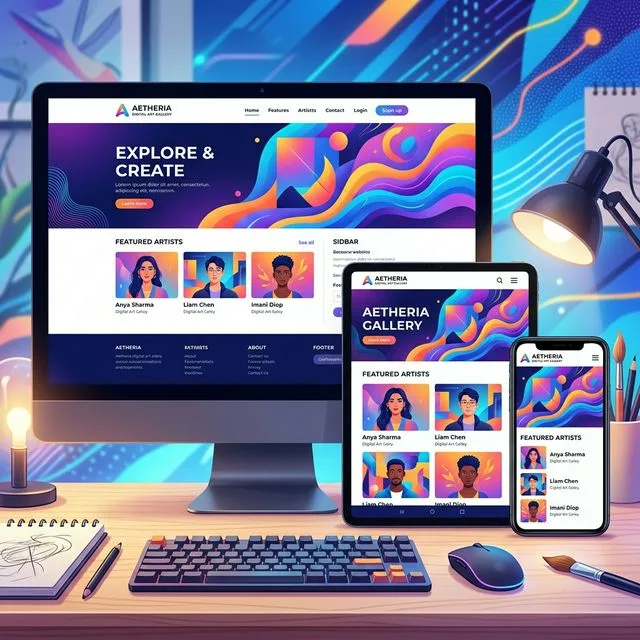
What Does RWD Look Like in Practice?
The purpose of responsive design is to maintain a single core website but implement fluid elements that respond beautifully when viewed on varying screen sizes.
Let’s consider a traditional “fixed” website. When viewed on a desktop computer, the website might display an elegant three-column layout. But when viewed on a smaller tablet, that same fixed layout might force the user to scroll horizontally—a thoroughly frustrating user experience. Elements might be hidden from view, overlapping, or completely distorted. This issue is complicated further by tablets switching between portrait and landscape orientations.
On a tiny smartphone screen, these fixed websites are incredibly difficult to navigate. Large images break the layout entirely, and heavy graphics completely slow down mobile load times.
However, if a site utilizes Responsive Design, the tablet version automatically detects the screen width and adjusts to display two columns instead of three. The content remains highly readable. On a smartphone, the design automatically stacks the content vertically into a single column. Images resize proportionately rather than distorting or breaking out of their containers.
With responsive design, the user is guaranteed the best possible visual experience regardless of the device they happen to be holding.
How Does RWD Work?
Responsive sites utilize fluid grids. All page structural elements are sized by proportion mathematically, rather than strict pixel values.
For instance, if you have three columns, you wouldn’t strictly dictate that they each must be 300 pixels wide. Instead, you dictate how wide they should be in relation to the overall screen width. Column 1 might take up 50% of the page, column 2 takes up 30%, and column 3 takes up 20%.
Media elements, such as images and video embeds, are also styled using relative units. This ensures an image never expands past the boundaries of its parent column.
Why do Businesses Need RWD?
Due to the tremendous surge in smartphone usage over the last decade, possessing a responsive website design is no longer a luxury; it is a necessity.
More often than not, over 50 percent of your total visitors will be exploring your site via a mobile device. Today, consumers almost universally review a company’s website before choosing to conduct business with them. First impressions are purely digital.
By investing in a Responsive Web Design, you impress potential clients immediately, provide a frictionless browsing experience, and fundamentally improve your ultimate conversion rates.